Mapping Osriel in CC1
Yesterday, Bruce Heard announced the beginning of the Kickstarter for his second Calidar book, CC1 Beyond the Skies. You probably already know that it’s a book of deities and demigods, divided into pantheons, with one for each Great Calderan nation. Osriel, however, is a special case.
The lands of Osriel were originally known as the Dawn Wilds, and they were fought over by all of the lunar races and their colonies. To further complicate things, their gods made a number of deals with the Gate Keeper to bring in new colonists from the Vortex. These cultures from another dimension mixed with the lunar colonists, eventually forming eight or nine states, each with different culture and language.
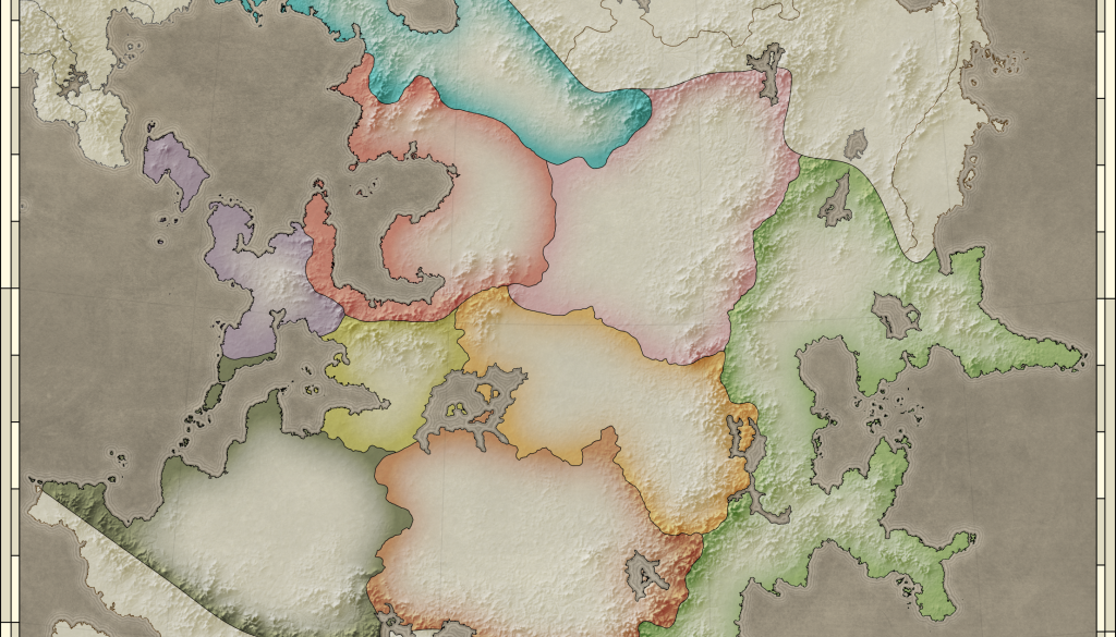
Eventually the disparate realms joined into a single nation, unified by its interest in multiculturalism and trade. As a result, the gods of Osriel are many and varied; known as the Calderan Pantheon, Osriel’s pantheon draws its gods from all over the Great Caldera.Because of this, the map for Osriel has a very different job than the other nations’ pantheon maps. It’s primarily a political map, showing for the first time the provinces of Osriel. My first instinct was to make a purely political map, stripping out all unneeded detail to focus solely on the political borders. I started with a subtle shaded relief, and a beige, parchment-like colour scheme. On top of this I added only the settlements and terrain labels referred to in the text, with coloured outlines emphasising the borders.
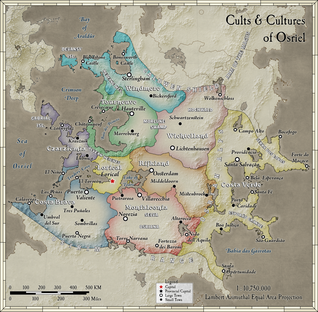
I like the overall style, but somehow it didn’t quite do what I wanted it to. So after discussion with Bruce, we decided to bring in the terrain and rivers, but only for Osriel — emphasising the topic of the map, giving a good overview of the terrain, while also of course providing the new information about the internal political borders.

What do you think? Which version do you prefer? Is there anything you would change about either of these to make them better? I’d love to hear your feedback.
In the meantime, please do check out the Beyond the Skies Kickstarter. The more people that back it, the more art Bruce will be able to buy for the book. It’s a great book — I know, because I’ve proofread it all at least twice! Please check it out, and back the project if you can. Of course I have backed it myself, too.
2 December 2015 @ 10:32 pm
Love that last one! 🙂
3 December 2015 @ 5:32 pm
I like the first one for its cleanness. For what you describe it also seems to be the one that does the job the best. With that many text labels, the second one gets a bit messy for my taste, especially at that small scale.
If this was to be the only map of Osriel I was going to have, I would have gone for the second one, simply for the wealth of information it conveys, but if I wanted a map to clearly see the political divisions and location of important named terrain features, I would go for the first one.